Obama vs. Paul Ryan Budget Plan: Interactive Graph

The following interactive graph for comparing the Paul Ryan and Barack Obama budget proposals is pretty nifty. Here's how to read it:
Whitehouse Budget Summary TablesPath to Prosperity
What strikes me is how closely so many of these line graphs trend together. Then note on Medicare, that far from pushing grandma off a cliff, the graph looks like Ryan is pushing her uphill. His plan spends even more than Obama's! Just another example of reality and rhetoric not matching up. This is why it's important to look at cold, hard facts like numbers on "boring" graphs instead of just reading bumper stickers and listening to talking heads argue.
Have at it:
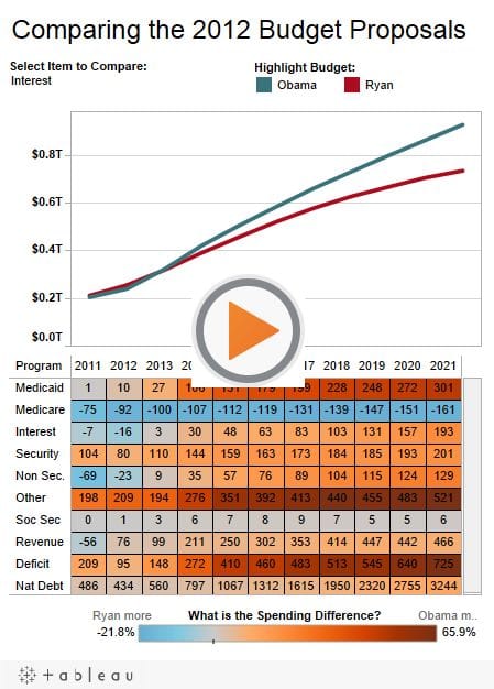
Interactive graph by: Tableau Software
Hat tip: Zero Hedge for the good find